The time has come to reveal my latest avocation. I’ve been messing around with acrylic paints for the past month. There was a time back in my college years when I experimented with visual art — acrylics and oils. I didn’t go very far with it then, but for the past year or so, the urge had been building in me to try it again. I had a great epiphany: if you feel like painting, you don’t have to imitate photos. You don’t have to paint rustic barns, farm ponds, or covered bridges (though you can if you want). So in this month of March, I’ve taken up the brush again and decided to be as weird as I want.
Don’t expect too much from the images you are about to see. Think kindly of them, because I haven’t had any training whatsoever. I simply wanted to try a form of expression that’s different from writing — to exercise parts of the imagination that don’t necessarily get to work in the written word. And anyway, I think it’s good to stretch ourselves and to try new things now and then.
I’ve found painting to be extremely satisfying and relaxing. It’s a challenge of just the right sort. Well, I know you’re already scrolling down to see what I’ve got here and aren’t in the mood just now to wade through any more preliminary rambling. All right, all right! Scroll down, already! I’ll present each image, and then provide some explanatory notes.
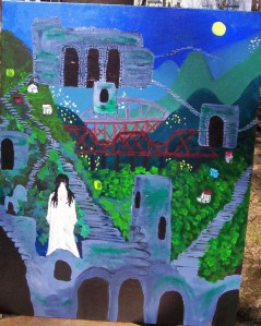
The Uncanny City is a nickname some friends and I have for Pittsburgh, Pennsylvania. These first two paintings are intended as a diptych: a
single image spread over two panels. At Pittsburgh, the Allegheny and Monongahela Rivers join to form the Ohio River. With three rivers and valleys and ravines yawning on every hand, Pittsburgh is, for one thing, a city of bridges: it has 446 of them — more than are in Venice, Italy. The city also has 712 sets of stairs, making up more than 24,000 vertical feet — a greater vertical distance than you’ll find in San Francisco, Portland, and Cincinnati combined! My impressions of Pittsburgh are of steep, wooded mountainsides receding into the mist; ancient, often little-used stairways ascending and descending, often in the most unexpected places; crumbling
stoneworks — actually old foundations and cellar entrances, I’m told, but reminiscent of portals into subterranean realms. At night, there are winking lights on the towers, on the bridges, on the slopes, and reflected in the water. It’s a city once choked in industrial grime, but now considerably cleaned up for a new era. It’s called a “renaissance city,” reborn from the ashes of fiery forges, and now growing in many new and exciting ways.
My paintings here are meant to reflect the Pittsburgh that I see, like Middle-earth, a place built over the ruins of the past, with half-buried secrets showing through the leaves: a place of whispers, echoes, moonlight, ghosts, and things uncanny . . . where dark doorways stand open, and stairs might lead anywhere.
Kind of fun, huh? When I was doing the first set of those, I didn’t like them until I put in the stoneworks and stairways floating in the sky. That element is what, for me, laid in the intangible quality of Pittsburgh that I was trying to capture — something like what Neil Gaiman described in Fragile Things as “a room that’s locked but isn’t there.” If you put each pair side-by-side, the left panels line up with the right, continuing the image. It’s a popular thing to do with fantasy book series, for example: to have a picture that extends across all the covers when the books are laid out adjacent to one another — and/or possibly another image that runs across the spines.
Anyway, here’s one I call Shadowland:
The somber figures troop in a weary file through a country of gloom and shadows. Beneath a gap in the clouds is a forest aglow with sunlight. The figures react to it, but trudge past; it is not on their path — they are either unable or unwilling to go there. Do they regard the lighted country with longing, despair, awe, consternation, terror, or a vague uneasiness? I’m not sure what to make of the fact that the walkers’ legs are more canine than human.
I like the colors and composition of this one. Dirigibles, gears, pipes, dials, steam, mysterious strangers in Victorian garb, and a pocket watch — what else is there to say? — Steampunk!
Heh, heh! — But which figure is the self-portrait? Or are they both? Is the picture a kind of mirror? That’s a wall and window dividing it down the center, if you can’t tell. The faun is dancing in the moonlight outside the cottage where the writer listens, watches, and scribbles by the light of a lamp and candles — taking the dictation of the summer night. Let me show you the components of this one up closer:
No, this one’s not a painting. It’s a picture of me painting at my aunt’s house, where I was visiting in Illinois this month. I’m grateful to my aunt and uncle for sacrificing this room: for a few weeks, they couldn’t really walk through it, with all the painting supplies strewn everywhere.
A ripe, autumnal fruit is honeycombed with arches, passages, and stairs: the delvings of the worm, who sits in his easy chair, visible through an upper window as he smokes his pipe. Through another window, a portrait of a worm is visible hanging on a wall. The worm has made this fruit his home. This painting and the variation which follows were inspired in part by William Blake’s poem “The Sick Rose.” Are these pictures purely whimsical, or are they pretty dark in theme? You decide!
In some ways I like this refinement better: I wanted the fruit to be more clearly an apple, and this version is less cluttered than the first. Here we have the addition of the ladder, welcome mat, and mailbox, and the worm’s head is visible. But he looks a bit too much like the caterpillar in Alice in Wonderland, which I don’t intend. I like the way the shapes of the arches look very much like crawling worms themselves. I like to nest images one inside (or atop) another, as in this next one:
Cassie is my aunt and uncle’s border collie. She’s not really green — I took some artistic license on that point. Aunt Alice requested a portrait of Cassie, who is my daily walking companion when I visit. (Don’t miss the clouds!) Wouldn’t this make a good Cricket Magazine cover?
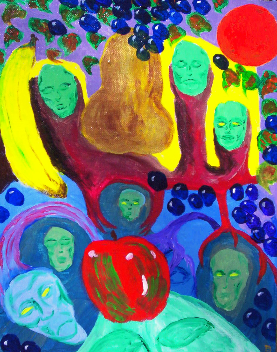
In this one, the eerie faces emerged first. I knew it was about them, but I didn’t have the context — the juxtaposition that makes for an interesting painting. Just when I thought this picture would be a lost cause, I realized what it needed: lots of ordinary fruit to give the faces their place as sources of disquiet.
Now here are the two that, for the present, are probably my favorites:
It’s probably best if I don’t even attempt to explain. Make of it what you will. Again, I had to paint a second, alternate version:
This second rendition makes me think of Lovecraft’s Cthulhu stories. . . .
And let’s end on a more comforting note:
I’d like to try something else along these lines when I’ve gotten a little better; it uses a wash technique to simulate light shining through stained glass. The statues along the bottom were painted in shades of gray and blue, then covered with a thin, watery layer of another color once they were dry; I like how the highlights show through. I like the compositional balance of the picture. Yeah, I know that one window looks an awfully lot like a dart board. . . .
So there you have it — my first round of acrylic pictures. I intend to keep working at this, so I’m really curious to know what you like and what you dislike about these.
Of course, I’m not really a painter, so 1.) you won’t hurt my feelings if you hate them, and 2.) I’d better turn back to some writing one of these days.
Until soon!


